A Suggestion to Improve The Micro,Blog UI?
Currently, the official Micro.Blog app has a permanent menu that sits at the bottom of the screen, like this.
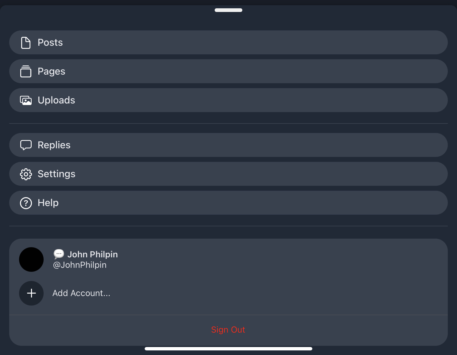
There is a second menu that can be found by clicking on your user image, top left, that looks like this.
Suggestion … add the 4 choices in the first example to the second menu.
Why? So I have only one place to go to for all possible operations.
Bonus thought. In settings, allow me to hide that bottom menu in user settings.
Currently, the official Micro.Blog app has a permanent menu that sits at the bottom of the screen, like this.

There is a second menu that can be found by clicking on your user image, top left, that looks like this.
Suggestion … add the 4 choices in the first example to the second menu.
Why? So I have only one place to go to for all possible operations.
Bonus thought.
In settings, allow me to hide that bottom menu in user settings.